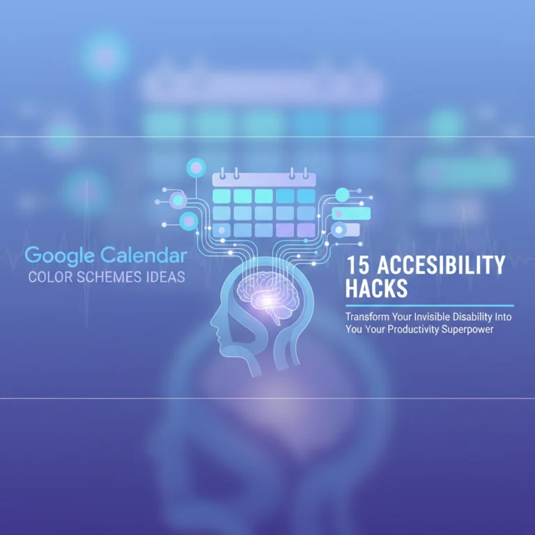
The world has shifted, and for those of us navigating the neurodivergent experience, the standard digital tools we use every day are often a battlefield rather than a bridge. If you have ADHD, opening a standard Google Calendar can feel like staring into a blinding white sun. It’s just a "wall of text", a flat, uninspiring list of obligations that all look exactly the same.
When every task has the same visual weight, your brain struggles to decide what matters most. This is where time blindness kicks in. You see a meeting at 2:00 PM and a reminder to buy milk at 3:00 PM, and your brain treats them with the same level of urgency, or worse, it ignores both because it’s overwhelmed by the clutter.
The question is, how can we turn this source of anxiety into a dopamine-friendly calendar? How do we build a system that doesn't just track time, but actually helps us feel empowered to take on the day?
At Dr. Disruptor, we believe in radical self-advocacy through better systems. It’s not about "fixing" your brain; it’s about decorating the environment to suit the high-performance engine you’re already running. By using specific color schemes, you can create a visual hierarchy that reduces cognitive load and turns your calendar into a lifeline rather than a chore.
Why Color Coding is the Antidote to Time Blindness
For the ADHD brain, time is often a "double-edged sword." We are either hyper-focused on the now or completely oblivious to the later. Time blindness isn’t a lack of discipline; it’s a sensory processing difference. A monochrome calendar feeds this blindness because there are no landmarks.
Imagine driving in a city where every sign is the same shade of gray. You’d miss every turn, right? A dopamine-friendly calendar uses color as a GPS. By assigning specific meanings to colors, you provide your brain with "pre-attentive" cues. This means you know what you’re looking at before you even read the words.
Using a visual hierarchy allows your brain to skip the "deciding" phase and go straight to the "doing" phase. Here are three proven color schemes to help you reclaim your schedule and defeat the fog.

1. The "Street Light" Urgency System
This is perhaps the most intuitive system for those who struggle with transitions. The Street Light system categorizes tasks based on their "moveability." In the world of ADHD, we often struggle to know which deadlines are "hard" and which are "soft." This ambiguity leads to paralysis.
In this scheme, you create four distinct calendars within Google Calendar:
- Red (The "Hard" Stop): These are your fixed commitments. Meetings with the boss, doctor appointments, or flights. If you miss these, there are real-world consequences. Red tells your brain: "Do not pass go, do not collect $200. This is happening."
- Yellow (The "Steady" Work): These are important tasks that are time-blocked but slightly flexible. Think of things like "Deep Work" sessions, gym time, or grocery shopping. They need to happen today, but the exact start time could shift by 30 minutes if needed.
- Green (The "Flexible" Fun): These are your rewards. Gaming, reading, or grabbing coffee with a friend. Green signals to your brain that dopamine is coming.
- Blue (The "Background" Noise): These are recurring routines. Morning rituals, taking your meds, or checking emails. They are the "blue sky" of your day, always there, but not requiring high-level panic.
By using this system, you can quickly toggle off the "Green" and "Blue" calendars when you’re feeling overwhelmed. This leaves you with only the essential Red and Yellow tasks, instantly lowering your cognitive load.
2. The Color Saturation Approach (The Gradient Method)
If you find that too many colors make your eyes hurt, the Saturation Approach might be your best friend. This method relies on the intensity of the color rather than the hue itself. This is particularly helpful for people who also deal with sensory processing sensitivities, which often go hand-in-hand with ADHD.
Think of a student who consistently submits assignments late. It’s often not because they forgot the assignment, but because the reminder for "Bio Paper Due" looked exactly like the reminder for "Laundry." With the saturation approach, we create a visual hierarchy based on importance:
- Bright, Saturated Colors (Hot Pink, Electric Orange): Use these only for "Unicorn Events." These are rare, critical, or one-time deadlines. Your brain is naturally wired to notice high-contrast colors first.
- Medium Saturation (Classic Blue, Grass Green): Use these for your daily work tasks. They are visible and clear but don't scream for attention.
- Desaturated/Pastel Colors (Lavender, Pale Grey, Sage): Use these for everything that happens all the time. If you work a 9-5, that block should be a desaturated color. Why? Because you already know you’re at work. You don't need your calendar to scream "WORK" at you for eight hours.
By fading the routine tasks into the background, the important stuff "pops" off the screen. You’re teaching your brain what to ignore so it has the energy to focus on what matters. This is a key strategy we discuss often in our Accommodations resources, adjusting the environment to fit the person.

3. The Life Categories System
For many of us, the struggle isn't just about urgency; it’s about balance. We get so sucked into one area of life (usually work or a hyper-fixation) that we forget the other parts of being a human. The Life Categories system helps you visualize where your energy is going.
- Green for Growth: Health, therapy, gym, and personal development.
- Red for Responsibility: Work tasks, bills, and deadlines.
- Yellow for Connection: Social events, family time, and phone calls.
- Purple for Passion: Hobbies, side projects, and creative outlets.
When you look at your week in "Month View," you should see a rainbow. If your calendar is a solid block of Red, you’re on the fast track to burnout. If it’s all Yellow, you might be avoiding your responsibilities.
This system acts as a mirror. It forces you to see the "Invisible Not Forgotten" parts of your life, like your own well-being. Check out our thoughts on being Invisible Not Forgotten to see how we advocate for the parts of ourselves that often get sidelined.
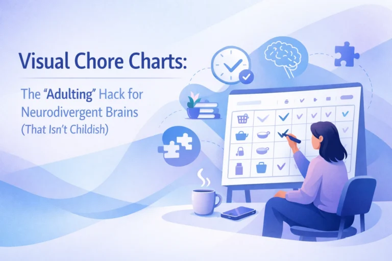
Building Your Own Disruptive Systems
Setting up a dopamine-friendly calendar is an act of self-love. It’s a way of saying, "I know how my brain works, and I’m going to support it." But we know that setting up these systems can sometimes be a hurdle in itself.
If you’re looking for more ways to hack your productivity and hear from others who are disrupting the status quo, you’ve got to check out 'Plugged in: The Disruptor Podcast'. We dive deep into tech, disability advocacy, and the "how-to" of living a powered-up life.
And hey, if you’re a builder or a creator looking to launch your own app or website to help the community, we highly recommend checking out Marblism. It’s a fantastic tool for getting your ideas off the ground quickly without getting bogged down in the "how" of coding. It’s the ultimate shortcut for the "Idea Person" with ADHD.

Final Thoughts: Don't Let the Calendar Own You
The goal of color coding isn't to create a perfect, pretty picture. It’s to create a functional tool that works when you’re tired, when you’re distracted, and when your brain feels like it has 47 tabs open.
Why do we settle for systems that weren't designed for us? Why do we try to force our round-peg brains into square-hole calendars? The world might pat itself on the back for "inclusion," but true empowerment comes when we take these tools and make them our own.
Take 10 minutes today to try one of these schemes:
- Pick three colors.
- Assign them to your most common tasks.
- Notice how your heart rate drops just a little bit when you look at your day.
You aren't broken, and you aren't "bad at time." You just haven't painted your map yet. Go ahead: disrupt the default settings and build a schedule that actually smiles back at you.
For more tips on navigating life with a "disruptive" brain, keep exploring our portfolios and join the conversation. Your brain is a powerhouse; let’s give it the dashboard it deserves.