The world has shifted into a digital-first reality where our eyes are glued to screens from the moment we wake up until we finally close our eyes at night. For many, this is just "the way it is." But for neurodivergent professionals, students, and advocates, this shift has brought an invisible, exhausting barrier: the blinding glare of the default white background.
We often talk about physical ramps and sign language interpreters when we discuss accessibility, but we rarely talk about the photons hitting our retinas. If you’ve ever opened your phone to check your schedule and felt a physical wince or a momentary brain fog, you aren't alone. Your sensory processing is sending you a signal. It’s time we stop treating "dark mode" as a trendy aesthetic choice and start seeing it for what it truly is: a practical accommodation.
The Blinding Reality of the Digital Default
Think about the last time you walked out of a dark movie theater into the high-noon sun. That sharp, stinging sensation in your eyes? That’s what many neurodivergent individuals feel every time they unlock their devices to check their Google Calendar widget.
For those of us living with ADHD, Autism, or Sensory Processing Disorder (SPD), the standard "Light Mode" isn't just bright; it's loud. High-contrast white screens can cause "visual snow," increase the frequency of migraines, and create a level of digital friction that makes staying organized feel like a Herculean task. When your brain is already working overtime to filter out background noise, navigate social cues, or manage executive dysfunction, the last thing you need is your calendar yelling at you in 500 nits of white light.
At Dr. Disruptor, we believe that empowerment starts with understanding how our environments: both physical and digital: impact our ability to thrive.
Decoding Sensory Processing in a Digital Age
To understand why a Google Calendar widget dark theme matters, we have to look at how our brains process visual information. Sensory processing is the way our nervous system receives messages from the senses and turns them into appropriate motor and behavioral responses.
When a screen is too bright, it triggers a physiological stress response. The pupils constrict, the muscles around the eyes tense up, and the brain has to exert extra energy to distinguish text from the glowing background. For neurodivergent professionals, this contributes to a phenomenon known as cognitive load.
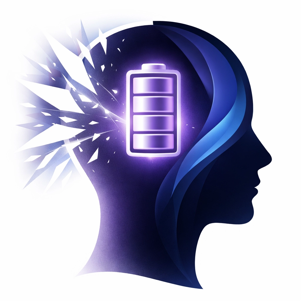
The Hidden Tax of Cognitive Load
Cognitive load refers to the used amount of working memory resources. Imagine your brain is a smartphone battery. Every task you perform drains a percentage of that battery.
- Answering an email: 5%
- Attending a meeting: 15%
- Processing a blindingly white calendar screen: 10% (every single time you look at it).
By the time lunch rolls around, your "battery" is in the red, not because you’ve done a massive amount of work, but because your brain has been fighting the interface of your tools. This is the "hidden tax" of poor digital accessibility. When we enable dark mode, we are effectively reducing the "power draw" on our brains. It allows us to focus on the content (the meeting, the deadline, the chore) rather than the delivery system.
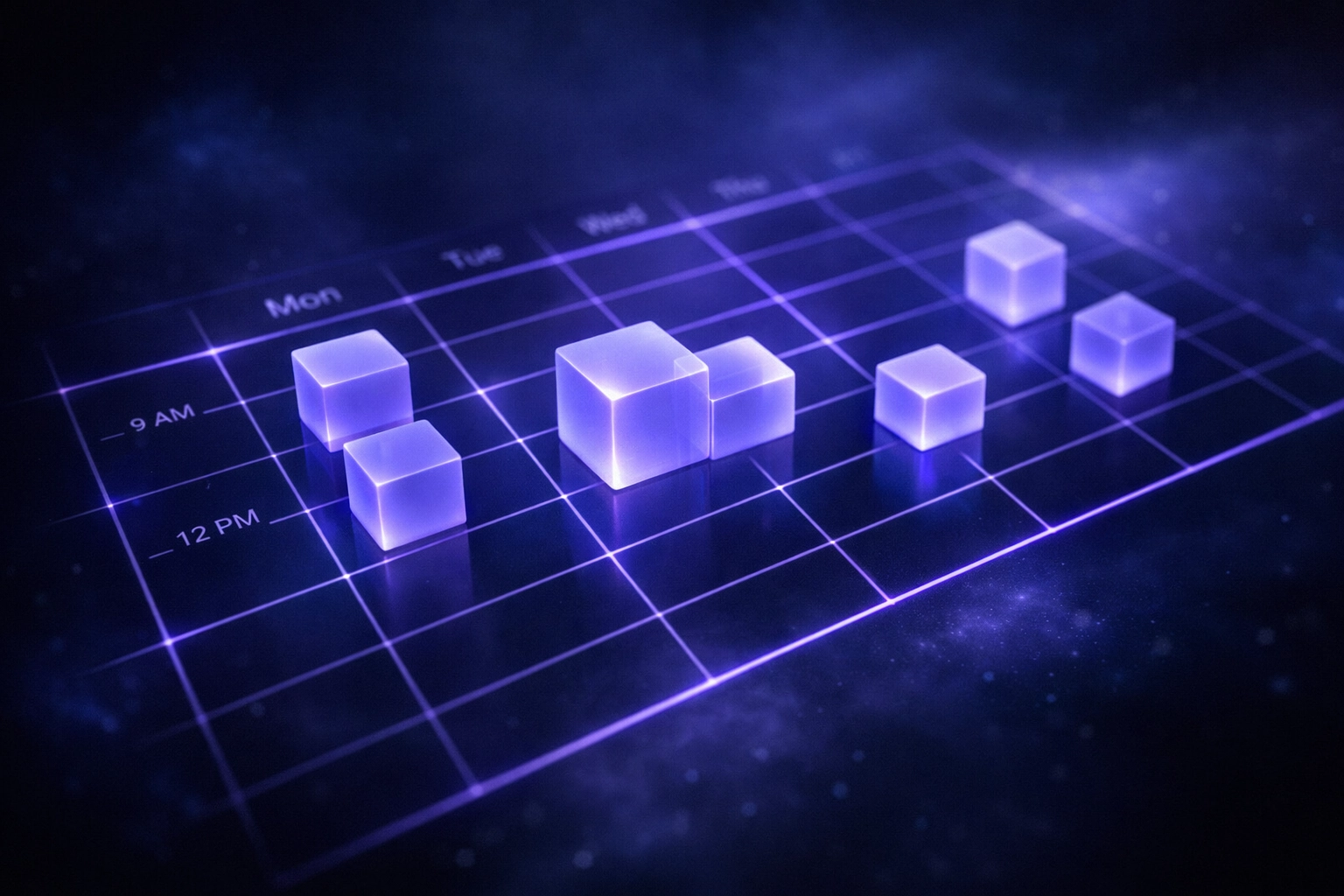
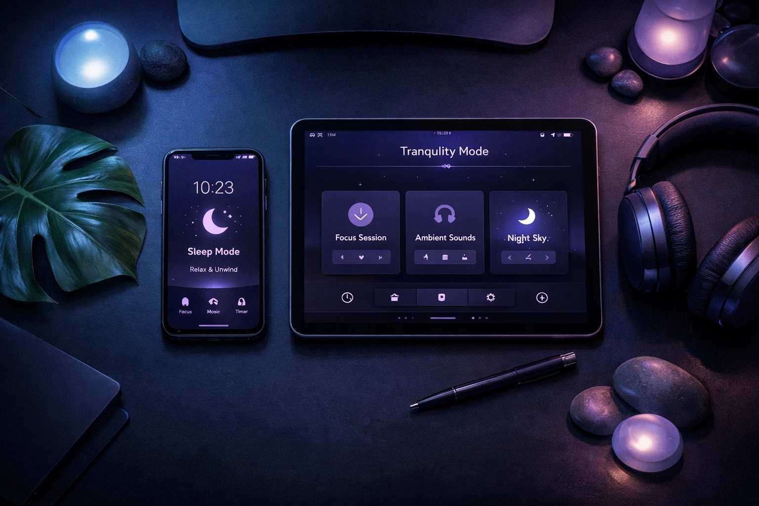
Why the Google Calendar Widget is Your Command Center
For many of us, the Google Calendar widget is the literal map of our lives. It sits on our home screens, offering a glanceable view of what’s next. It’s a disability-friendly lifeline that keeps us tethered to our responsibilities.
However, because we look at this widget dozens of times a day, its visual profile matters more than almost any other app. If that widget is a bright white square on an otherwise balanced home screen, it becomes a source of visual "stuttering."
The Widget Advantage: Glanceability vs. Friction
The goal of a good visual chore chart or calendar is to provide information with zero friction. You should be able to glance, internalize, and move on.
- Light Mode Friction: Glare makes it harder to read small widget text, leading to squinting and increased eye strain.
- Dark Mode Flow: The lower contrast between the background and text (when styled correctly) allows the eyes to relax, making the information pop without the "halo effect" often seen on bright screens.
By using a Google Calendar dark theme, you are creating a workspace that respects your neurological boundaries.
Beyond Aesthetics: Dark Mode as a Vital Accommodation
It’s time to challenge the institutions that dismiss dark mode as a "preference." Many corporations and software developers still treat accessibility as an afterthought, something they can "pat themselves on the back" for doing once they’ve hit a bare minimum.
But for someone with sensory sensitivities, being forced to use a high-brightness interface is like being forced to work in a room with a buzzing, flickering fluorescent light. You might be able to do it for an hour, but your productivity and mental health will suffer in the long run.
The Benefits Are Measurable
Our research and general studies on digital ergonomics show that dark mode provides:
- Reduced Eye Fatigue: Fewer adjustments for the pupils means less strain on the ocular muscles.
- Minimized Flickering: Some screens have a subtle flicker that is more noticeable on white backgrounds, which can trigger seizures or sensory overload in sensitive individuals.
- Improved Sleep Hygiene: Reducing blue light exposure: especially when checking that final "what’s on for tomorrow" schedule at night: helps maintain melatonin production.
- Battery Efficiency: On OLED screens, dark mode can save up to 47% battery life at peak brightness. While this sounds like a tech stat, for a neurodivergent person, a dead phone is a lost external brain. Keeping that phone alive is a safety issue.
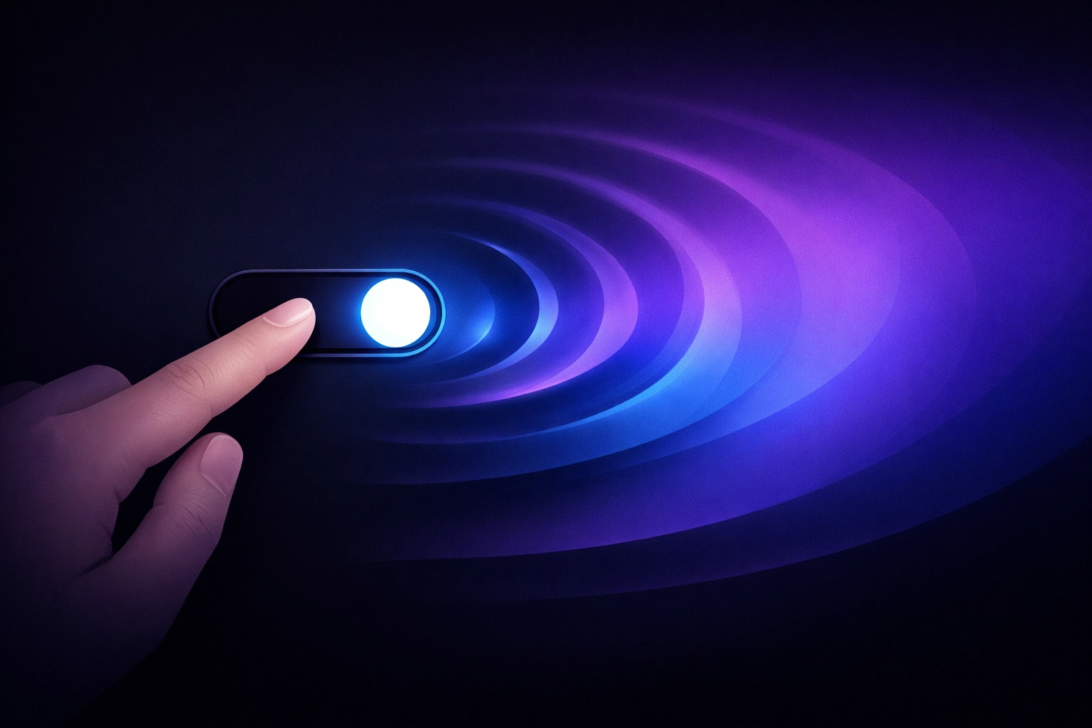
How to Claim Your Space: Setting Up Dark Mode
If you’re ready to lower the cognitive load, here is how you can transform your Google Calendar experience into something more sensory-friendly.
On Your Desktop
- Open Google Calendar in your browser.
- Click the Settings gear icon in the top right.
- Select Appearance.
- Choose Dark (or "Device default" if your system is already dark).
- Click Done.
On Your Mobile Widget (Android/iOS)
The widget usually follows the system-wide theme.
- Go to your phone’s Display Settings.
- Toggle Dark Theme or Night Mode to "On."
- Long-press your home screen to ensure your Google Calendar widget has updated.
Pro Tip: If you are looking for an even more integrated experience for your home, consider tools like the Cozyla Calendar, which are designed to be modern and clean visual aids for the whole family.
Shifting the Narrative
Why do we have to fight for these small changes? The question is, how can we expect neurodivergent professionals to compete in a high-speed world if the very tools they are given are designed to drain their energy?
At Dr. Disruptor, we don't just want you to "cope" with the digital world. We want you to disrupt the idea that "standard" is "accessible." Choosing dark mode for your sensory processing needs isn't about being picky: it's about being proactive. It's about recognizing that your brain works differently and that you deserve a digital environment that supports that difference.
We often see students or employees who consistently miss appointments or struggle to stay organized. Often, the critique is that they "aren't trying hard enough." But what if the problem isn't their effort? What if the problem is that their calendar: their primary tool for organization: is physically painful to look at?
Empowerment Through Design
Making the switch to a dark theme is a small, tactical victory in the larger battle for disability empowerment. It is a statement that your comfort and your neurological health matter more than the default settings of a multi-billion-dollar corporation.
As we look toward the future of work and education, we must continue to advocate for "Privacy and Preference by Design." Accessibility shouldn't be a toggle buried three menus deep; it should be the standard. Until then, we take the power back into our own hands, one widget at been time.
If you’re looking for more ways to optimize your digital life for your sensory needs, check out our YouTube channel for more deep dives into disability-friendly tech setups and reviews.
A Forward-Looking Vision
Imagine a workspace where your tools don't drain you. Imagine a morning where checking your schedule feels like a calm ritual rather than a sensory assault. This is possible when we stop viewing these adjustments as "hacks" and start viewing them as essential lifelines.
The next time someone asks why your screen is dark, tell them it’s because you’re optimizing your brain’s performance. Tell them dark mode matters. Because when we reduce the noise, we can finally hear ourselves think.
Let's keep disrupting the status quo, one screen at a time. Your sensory health isn't a luxury: it's the foundation of your success. Turn down the lights, turn up your focus, and let's get to work.