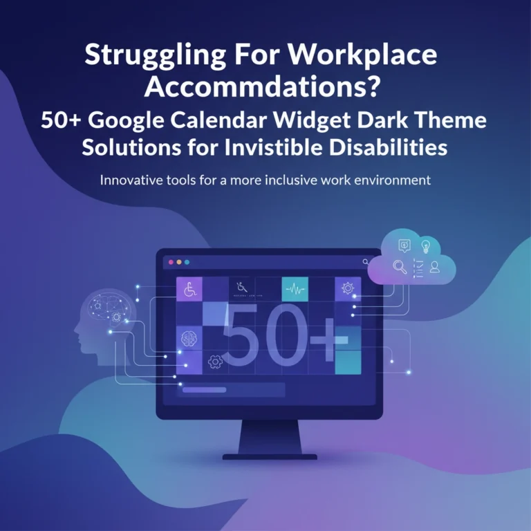
The world has shifted. We live in an era where our productivity is dictated by the digital rectangles in our pockets and on our desks. For many, a digital calendar is a helpful assistant, but for those of us navigating the complexities of ADHD, brain fog, and chronic fatigue, it can often feel like a visual screaming match. When your executive function is already stretched thin, opening a Google Calendar filled with neon "Tomato Red" and "Electric Blue" isn't just distracting, it’s physically and mentally exhausting.
Why does this matter? Because for the neurodivergent community and those with chronic illness, a calendar shouldn't be a source of stress; it should be a lifeline. Managing executive dysfunction requires a delicate balance of visibility and calm. We need to see what’s coming without being blinded by the glare of a thousand high-priority notifications.
The Cognitive Load of "Standard" Productivity
Most corporate productivity tools are designed for the "neurotypical" brain, a brain that can easily filter out background noise and prioritize tasks without much friction. However, institutions often pat themselves on the back for "accessibility" while ignoring the sensory overwhelm their default settings create. The question is, how can we reclaim these tools to serve our unique needs?
When you’re dealing with brain fog and chronic fatigue, your mental energy is a finite resource. Every bright, saturated color on your screen demands a piece of that energy. If your routine daily tasks (like checking email or doing dishes) are the same aggressive red as a doctor's appointment, your brain eventually stops distinguishing between "important" and "incidental." This leads to the dreaded "calendar blindness," where you look at your schedule and see everything and nothing all at once.
To manage this, we need a strategy centered on cognitive load management and visual flow.
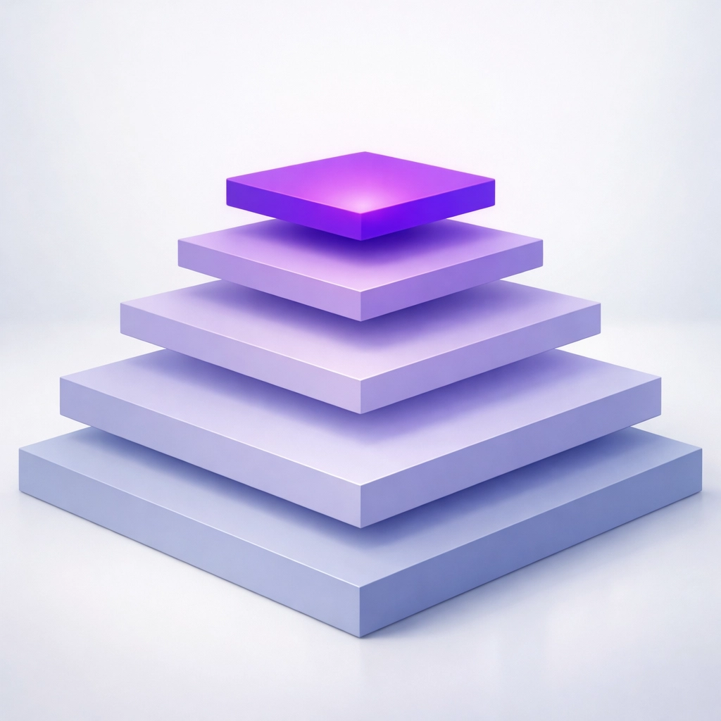
The Saturation Strategy: From Overwhelm to Clarity
The most effective way to manage ADHD and chronic fatigue in a digital space is to use color saturation as a hierarchy of importance. Instead of picking colors you "like," pick colors based on how often you have to look at them.
- High-Frequency/Routine Events (Muted/Desaturated): These are your daily anchors: work hours, morning routines, or household chores. Use desaturated, muted tones. These provide a "background" for your day without demanding immediate action.
- Moderate-Frequency Events (Medium Saturation): These are things like gym sessions, therapy, or social outings. They should be visible but not alarming.
- Rare/Critical Events (Bright/Saturated): This is where you use the "pop." Deadlines, one-time medical appointments, or major travel plans. By reserving bright colors for these items, you tell your brain fog exactly where to focus when your energy is low.
Refreshing Color Schemes for Your Google Calendar
If you’re ready to move away from the defaults, here are three custom hex-code palettes designed to soothe the eyes and clear the fog. To use these, click the "+" symbol in the custom color picker on your Google Calendar event or calendar settings.
1. The "Soft Focus" Pastel Scheme
This palette is ideal for those days when your chronic fatigue is peaking. It reduces the contrast between the background and the text, making the interface feel less "sharp."
- Routine Tasks: #F7EDE2 (Creamy Linen)
- Work/Deep Work: #E7D7CB (Muted Sand)
- Self-Care: #D2C1B3 (Soft Taupe)
- Critical Deadlines: #AA9D94 (Warm Slate)
This scheme creates an understated vibe. It’s the digital equivalent of a quiet room with dimmed lights.
2. The "Grounded Earth" Scheme
For individuals with ADHD, grounding is a vital technique to manage the "ping-pong" nature of the mind. Earthy tones are naturally calming and help provide a sense of stability.
- Daily Habits: #EBD2BC (Pale Clay)
- Social/Family: #C7976F (Toasted Almond)
- Medical/Health: #B26E4B (Terracotta)
- Urgent/Must-Do: #66422D (Deep Espresso)
By using earthy browns and oranges, you create a schedule that feels organic rather than clinical. It’s a great way to integrate tools like the Cozyla Calendar into your home environment, blending tech with a lifestyle focus.
3. The "Oceanic Flow" Scheme
Blue hues are scientifically linked to lowered heart rates and increased focus. If you find yourself frequently overwhelmed by anxiety related to your schedule, this is your go-to.
- Routine: #D1E3FF (Mist Blue)
- Learning/Projects: #A2C2E8 (Steel Blue)
- Appointments: #7199C1 (Ocean Wave)
- HARD Stops/Deadlines: #4A6D8C (Deep Navy)
Implementing the Change: Beyond the Hex Codes
Setting up your colors is only half the battle. To truly tackle executive dysfunction, you have to automate the habit.
- Label Everything Immediately: When an appointment comes in, don't wait. Use the "default color" for your specific calendar categories so the color-coding happens automatically.
- Use the 'Hue' Chrome Extension: If the Google Calendar defaults still feel too limited, tools like the Hue extension allow you even more granular control over your visual flow.
- White Space is Productive: If you have chronic fatigue, seeing a calendar with zero gaps is a recipe for a flare-up. Use a very light, almost-white color to block out "Rest Time." This makes the act of doing nothing feel like a deliberate, scheduled success.

Empowerment Through Community: Toolsurf and Advocacy
At Dr. Disruptor, we believe that disability advocacy isn't just about fighting for rights in the abstract: it's about finding the specific tools that make daily life more manageable. We are constantly searching for the "lifelines" that help our community thrive.
This is why we’ve partnered with Toolsurf, a platform dedicated to discovering and sharing the best tools for productivity and empowerment. Whether you're looking for a better way to manage your tasks or a new app to soothe your sensory processing needs, Toolsurf is an incredible resource.
Want to join the movement? We also have a referral program that rewards you for helping us grow this community of empowerment. By sharing our resources and the tools we discover, you aren't just helping yourself; you're helping a student who consistently submits assignments late due to fatigue, or a professional struggling to keep their head above water in a neurotypical world. Check out our portfolio to see more of the work we’re doing to bridge the gap between "standard" and "accessible."
Reclaiming Your Time
Is a color scheme going to cure chronic fatigue or eliminate ADHD? No. But can it reduce the daily friction that leads to burnout? Absolutely.
We often view our calendars as cold, hard taskmasters. But by taking ten minutes to input some custom hex codes and soften the visual impact of our day, we transform the calendar into a supportive partner. It’s about creating a environment where you don't have to fight your tools just to see what time it is.
The next time you open your Google Calendar and feel that familiar wave of brain fog, remember that you have the power to change the view. You don't have to live in "Tomato Red" anymore. You can choose a palette that respects your energy and supports your flow.
For more insights on managing life with invisible disabilities, explore our Invisible Not Forgotten project or stay tuned for our next post in this series where we dive deeper into physical workspace optimization for the neurodivergent professional.
Ready to start? Pick one palette today, apply it, and breathe a little easier tomorrow.